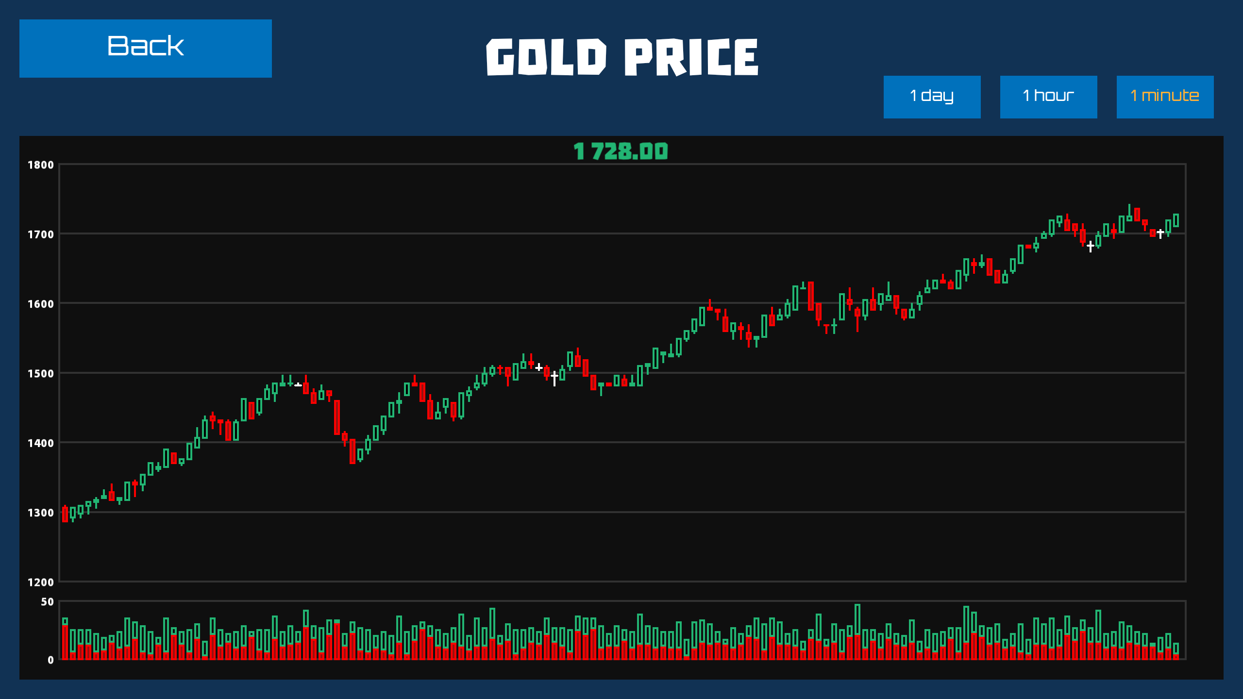
2. Price Chart
And now again select the Market tab.
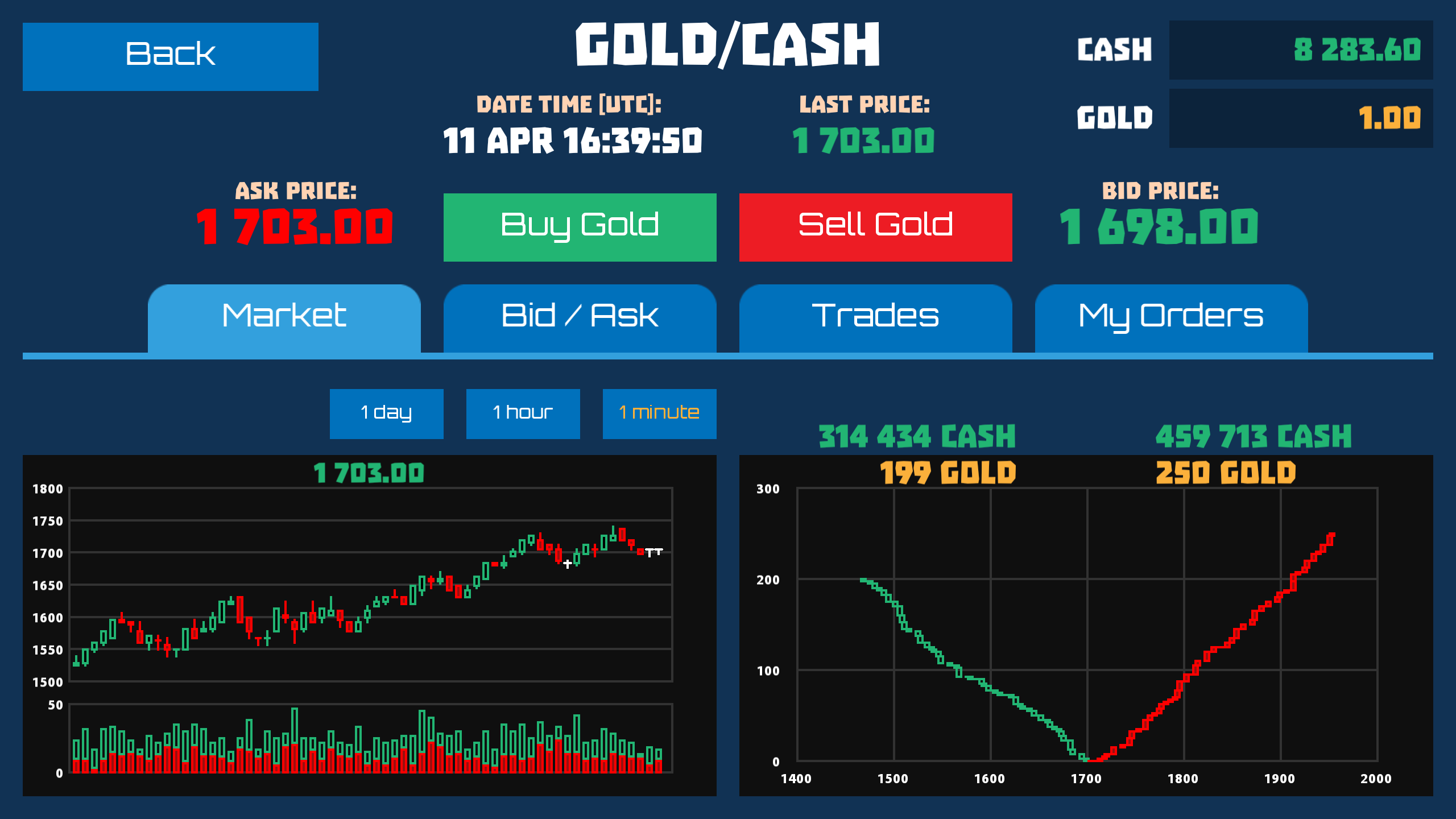
In the left part you can see the exchange price chart. A vertical scale is a price while horizontal is time. Each candlestick displays the price range of trades made in this chosen time interval. The range is displayed as Japanese candlesticks. Each candlestick contains 4 values: the opening price, the minimum price, the maximum price and the closing price. If the closing price is higher than the opening price, then the price has risen and the candlestick is displayed in green. If the closing price is lower than the opening price, the price has decreased and the candlestick is displayed in red. If the opening price is equal to the closing price, the price has not changed, then the candlestick is displayed in white.
Each candlestick represents a single time interval. You can see the charts in 3 available intervals: minute, hour and day.
To display the price chart in the full screen, tap it.