3. Bid/Ask Chart
In addition to the price chart, on the right side of the exchange screen you see the depth chart (the bid/ask walls). Its goal is to give you a visual idea of the buy and sell order balance on the market at the current moment.
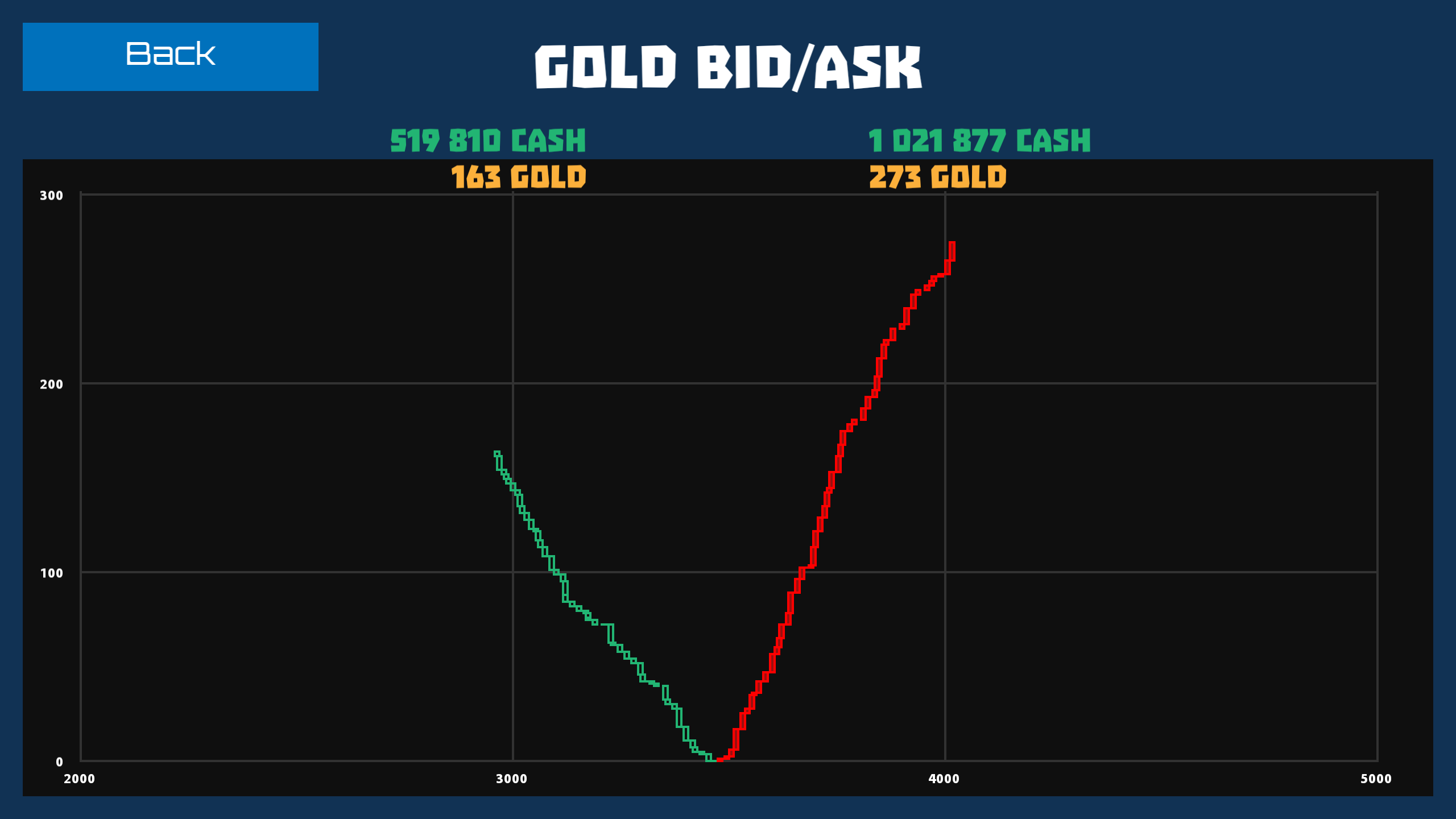
The horizontal axis is price and vertical is volume.
Each bid is displayed as a bar where the height of the bar represents its volume, that is, the quantity of GOLD, and the position reflects the price. Green bars are buy orders (BID), and red bars are sale orders (ASK).
The convergence of the curves displays the current market price. It's logical to read the chart from the convergence point in the direction of each curve. Each subsequent column of purchase orders is drawn higher and to the left, and sales orders are drawn higher and to the right.
Using this chart it's easy to determine what volume should be bought out or sold to the market so the price reaches a certain values. For example, the combined chart shows that if you sell 150 GOLD at a time, the GOLD price will drop from 3,500 to 3,000 CASH.
At the very top of the chart above the curves of the purchase and sale bids, the amount of GOLD put up for sale is displayed and the number of GOLD that can be redeemed is expressed in both CASH and GOLD.